Graphic Designer

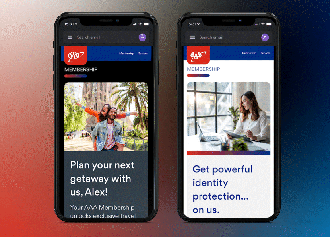
Following an internal reorganization, the AAA design team assumed responsibility for all email design. Recognizing the anticipated increase in workload, I proactively developed a flexible system of modular components. This system, inspired by the AAA website's visual language and informed by comprehensive research, enables any designer to efficiently create on-brand emails from a copy document within minutes. Collaboration with the development and UX teams ensured the integration of best practices and key features such as dark mode compatibility, alternate color themes, and seamless desktop-to-mobile responsiveness. This modular system has proven highly adaptable, effectively accommodating a diverse range of creative requirements while maintaining consistency.
Century Guild Woodcraft is a small, family-run workshop located in Sebastopol, CA. Renowned for their exceptional craftsmanship and meticulous attention to detail, they sought a minimalistic visual identity that would distinguish them without overshadowing their work. A sophisticated yet understated logo imparts a premium quality that resonates with their exceptional creations.
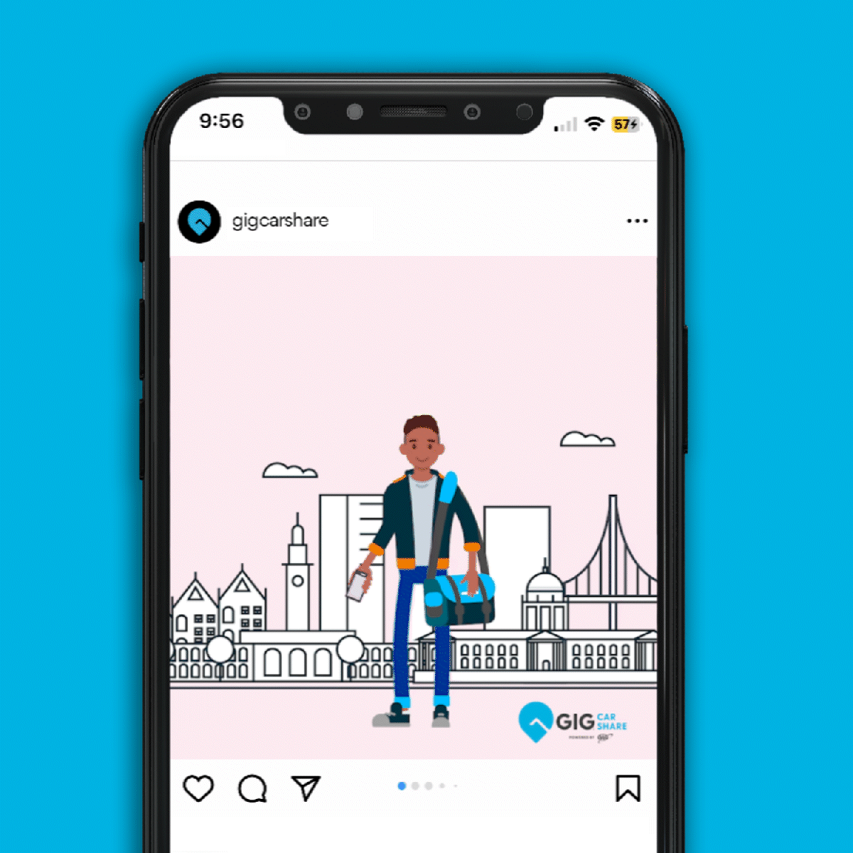
Prior to joining the central marketing team at AAA, my team provided support to AAA's innovation lab in Berkeley. A key initiative supported was GIG Car Share, a service operating in the San Francisco Bay Area and Seattle. In this role, I collaborated directly with marketing stakeholders to consistently produce assets for print, social media, and out-of-home advertising.
Magazine
Awarded an honorable mention in the 2021 Graphis New Talent Competition, Blip is a magazine dedicated to exploring all manner of unexpected deviations. Inspired by a love of the unknown and mysterious, these editorial designs feature dynamic layouts and funky typographic treatments.
Wine Label Design and Branding
Just as every wine is unique to it’s terroir, this label takes its inspiration from the winemaker’s region, featuring local wildflowers from the same hills and meadows. The hand illustrated floral patterns and California poppy logo are an ode to the craft of winemaking.
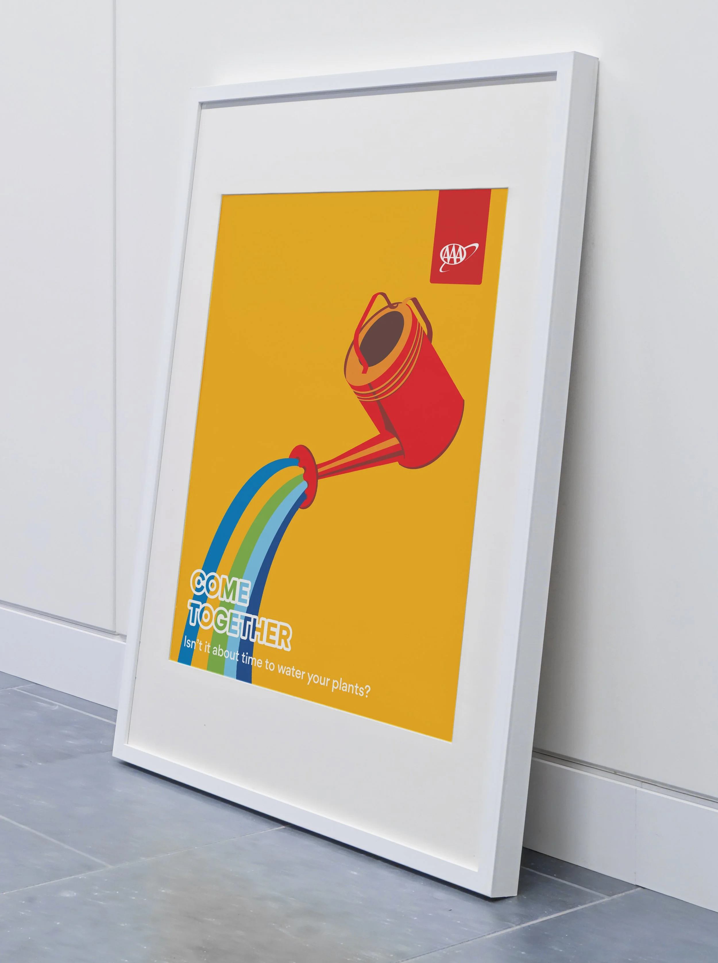
You know how the office can feel a bit blah sometimes, especially after a global pandemic? In order to liven things up, I created a bold set of hand-illustrated postcards, coasters, and posters. These were all about bringing some humor and color into the space and making folks feel more welcome on their return.
Album Artwork
Ophelia is the debut album from Swedish synth-folk artist, Meandrathal. Her dreamy pop songs—fused with mythology—are brought to life with an equally celestial photographic series, seen here as album artwork and designs for a release show. These soft photos are juxtaposed against glitched-out type, mirroring the way Meandrathal’s soundscapes are punctuated by sharp dissonances and distortion.
Restaurant Logo and Branding
Oakland is casual dining at its finest, serving comfort food inspired by the eclectic array of cultures found in CA, and appealing to young, adventurous urbanites. Bright colors and dynamic textures adorn a menu, business card, to-go bag, mini car, and a mobile site. These designs are centered around a bold, geometric logo, inspired by urban infrastructure, vintage funk posters, and Oakland’s architecture.